Painting a Drop Cloth – On Purpose
Usually paint on a drop cloth gets there by accident. Hey, drips happen, okay? Don’t judge.
However, there may be a case in which you might want to paint a drop cloth on purpose. Say, if you’re going to use said drop cloth as the fabric for the $20 Garage Sale Settee you’re refinishing. If you missed the previous installments in my Settee Series, I showed you how to De-Upholster & Reinforce the settee.
I also showed you how to strip…
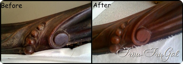
..and remove the old finish. I think I’m the only one amused by my stripper moves in that post. It still makes me laugh, though.
I wanted to give the fabric a little oomph. I love the drop cloth look, but I felt like the settee needed something more. I had several ideas in my head before settling upon the idea of putting maps on the fabric.
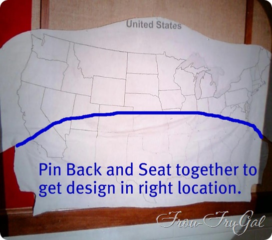
The first thing I did was to cut out my fabric. I used the old fabric from the settee as a pattern.
I also made sure to test my ideas on some scraps to make sure I liked how it looked.
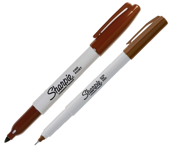
I used brown Sharpie Markers that I bought at Hobby Lobby. I used the Fine Point and the Ultra Fine Point.
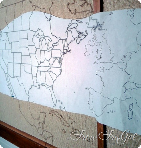
I found some maps online and printed them onto transparencies. You can buy a package of transparencies from any office store. Most printers will print on them. You just change the paper setting to “Transparency.” Easy, schmeasy.
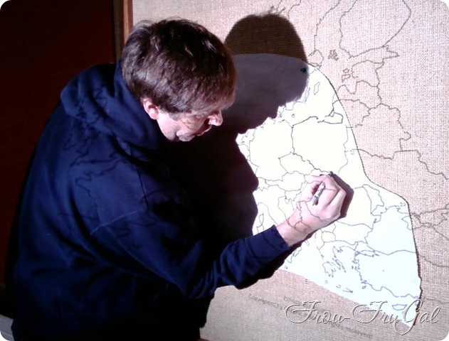
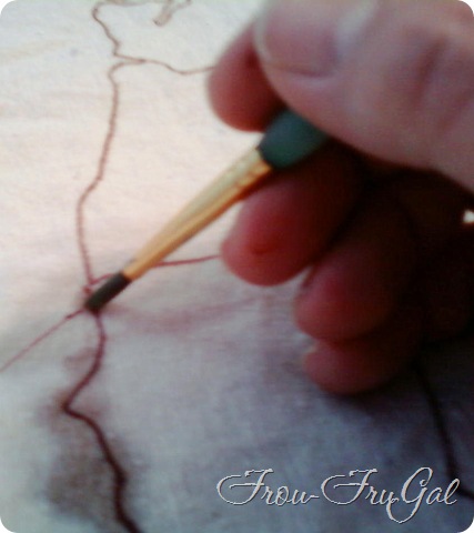
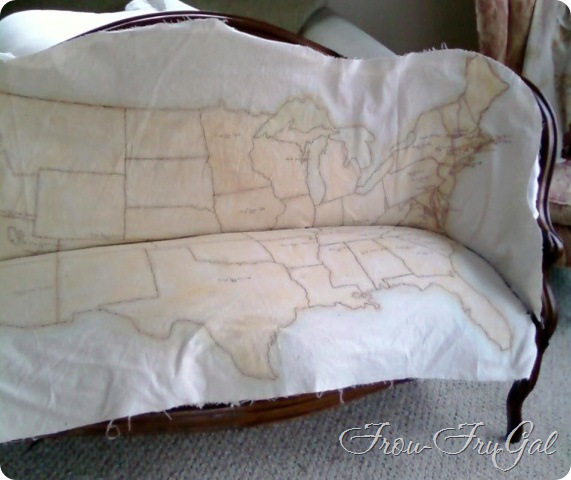
I then hijacked used the overhead machine at church and went to work. I tacked the fabric onto a wall section and using the larger Sharpie, went to town drawing the borders. Hubs was bored to tears sweet enough to come over to the church with me and do this activity for a “date night.” Who says romance is dead? We know how to mix it up just fine, thankyouverymuch.
I’m no cartographer, that’s for sure. The scale is wrong. In fact, Hawaii is very close to the continental US now and about a bajillion times larger. I have Hawaiian ancestors, though, and I wanted to represent them.
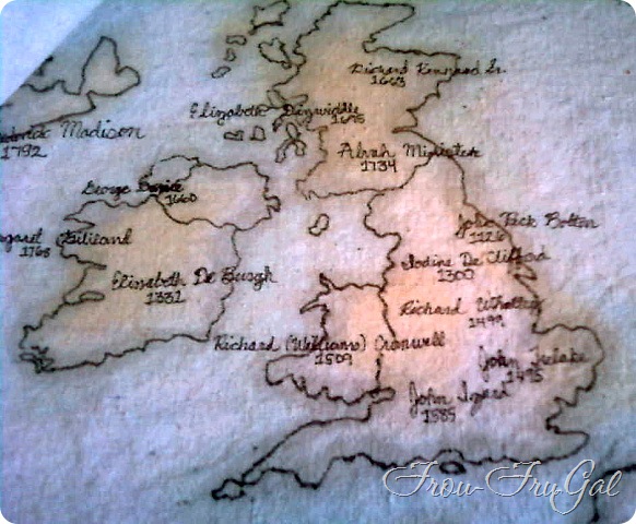
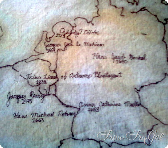
We have a lot of European/British ancestors. I wanted this portion of the map bigger so I could put more names in these areas.
After I got the maps drawn onto the fabric it was time to paint.
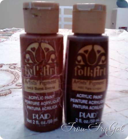
I dug into my box of Acrylics. Some of these haven’t been used in years. In fact, the Burnt Sienna was very thick and I had to thin it down with some water before I could even get it to come out of the bottle!
I can’t tell you ratio I used. The I did a few squirts of each color and filled the glass with water. After stirring them together, I tested them on some scrap and dried the fabric to see the final color.
I recommend mixing way more than you think you’ll need, especially if you’re mixing colors. It’ll be ridiculously difficult to match the colors if you run out. Trust me on this point.
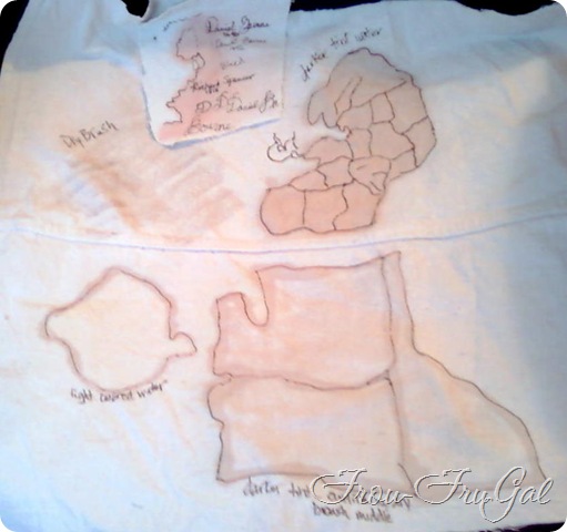
I used the brown color to outline the map details.
When you paint with such watered down paints, a funny thing happens. The color stays in the area where you painted it, but the moisture bleeds out into the fabric. It will look like a very large area is painted, when it’s really just wet. I let the fabric air dry while I worked on the other sections. After about an hour, I threw them in the dryer to finish drying.
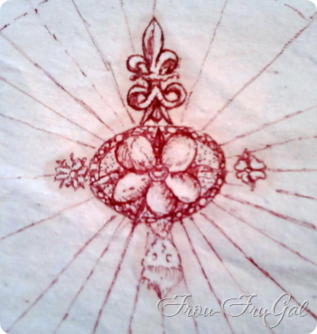
While researching maps, I came upon an image of a map from 1570. I copied the symbols from it. If you’re not familiar with map symbols, this is a compass rose. It’s used to show direction on the map. The North point is the Fleur-de-lis. I liked this symbolism here. A Fleur-de lis is a stylized lily. In French, “fleur” means “flower” and “lis” means “lily.” My name, also means “lily.” I like how that represents me.
A Fleur-de-lis is also a symbol used in the Boy Scouts of America program. Hubs is a lifelong scouter. He’s been in scouting ever since we got married. He’s the perennial scoutmaster/committee chairman/district commissioner/scout dad. Therefore, this symbol on the map represents both of us.
I couldn’t see all the lines coming out of the compass rose when I was transferring the image. I thought about adding them in, but I like them missing.
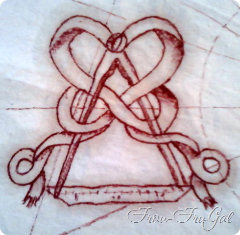
This symbol is for the Map Title and/or Description. Since I am doing an Ancestral Map, I wrote in this section:
“The Ancestral Map of David Bourne XXX and Suesan Elizabeth XXX, Sealed in marriage on February XX, 198X in Seattle, Washington for all time and for eternity in the House of the Lord.”
The last map symbol is the scale. It shows you how to determine the distance between points. Obviously, my scale is not accurate, but I love the design.
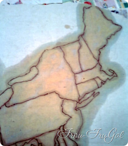
It took me several passes with the color to get it just right. After I had put in the shading, Buddy complained that it still needed something. He actually has a great design eye, so I went back in and added more color to the interior of the map. I’m glad I did.
After the blue for the water dried, I wasn’t excited about how baby blue it looked. When I went back over the interior of the maps with the yellow, I covered the blue water areas too. It made the water a greenish hue which I liked much better.
The picture below here is freshly painted, so the color is wet and more intense than in real life.
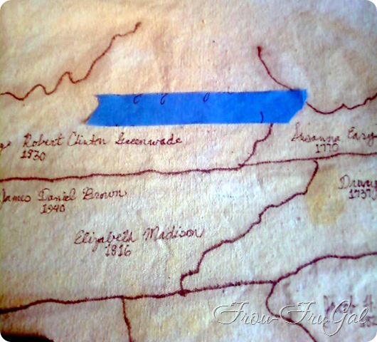
Once the fabric dried, I used the Ultra Fine Point Sharpie Marker to write in the names of our ancestors and the year of their birth. I tried to choose the first ancestor born in that location, but sometimes I just liked the name. These are all direct line ancestors.
Pretty much Hubs paternal line came from England/Ireland/Scotland came to the new world at New York and then migrated to Logan, Utah. His maternal line was similar. Came from the British Isles and landed in Massachusetts. If they weren’t on the first boats here (Mayflower), they were on the 3rd or 4th boat. His family stayed in the Cape Cod area for about 200 years and then migrated to Kansas via Wisconsin. Most of the names on the map are from the 1600-1700s, but I have some as far back as 1300.
My family is more complicated (in so many ways!) but they came from all over Europe. They landed mostly in the Southern states and then went everywhere. I have a Chippewa great-great-grandmother who traveled to Hawaii with some Episcopalian ministers, hence my Hawaii connection.
To get the names on the map, I used some blue painters tape to give me a line and then wrote the name in with the Sharpie. I went back in to fill all the letters tails. I did goof up on one part of the map and put on of the grannies in South Carolina instead of Georgia, or vice versa. I can’t remember now and I’m not digging through my genealogy again to figure it out. Sorry, Granny!
Here are some of the finished areas of the map.
The colors are the best I can get them. They look more intense here then they do in real life. In the next post where I show you the finished settee, you’ll get a better feel for the actual colors.
Cost Breakdown:
-
Garage Sale Settee – $20.00
-
De-Upholstering & Reinfocing Costs – $49.33
-
Stripping/Refinishing Costs – $15.39
-
Drop Cloth – $21.00
-
Sharpie Markers – $2.98
-
Transparencies, Paint, Tape – Stash on Hand
Total Project Cost to Date – $108.70
Total Project Time – About 8 hours or more. It took a lot of time to design, paint and research names and locations.
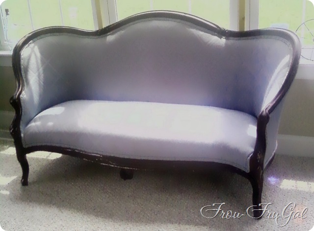
I finished the settee last night. I just need to write the final post.
Here’s a teaser of what’s to come:
Suesan
If you missed the other posts in this series, here they are:
-
Painting on a Drop Cloth – On Purpose
